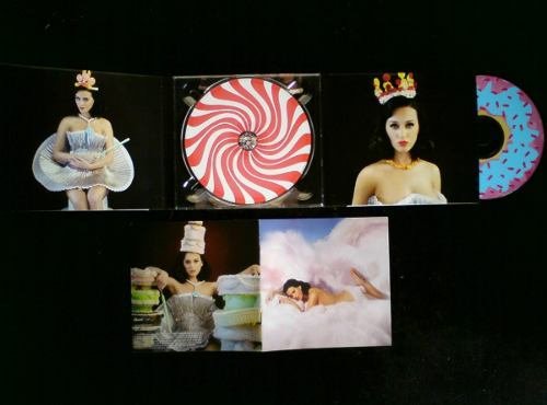
A digipak is defined by Wikipedia as "a type of optical disk packaging... Digipaks typically consist of a gatefold (book-style) paperboard or card stock outer binding, with one or more plastic trays capable of holding a CD or DVD attached to the inside."
There are different panels in a digipak. The front panel of the digipak is the cover of the album, and is the main promoter of the CD. The back panel may contain a design must usually includes the songs inside the album. Both the front and back album are the main promoters of the disc, so they must be eye-catching.
 |
| A rough draft of Em's album cover |
For the front panel, Emmanuelle contacted a friend to design it. The cover will be a silhouette of Em's head with different symbols inside of it. When confronted with this idea, Cat and I both loved it. Em's silhouette would allow the album cover to connect with her physical self in a way, but it also encompasses the different inspirations and seeds of imagination for all of the songs inside the album.
Cat and I asked Em about her decision for her silhoutte. Here is her answer: "My silhouette is just a representation of what's personal to me, like the aspects of my songs specifically have to do with what goes on in my head and they all have very personal meaning."
The rough draft to the right doesn't yet include the symbols inside her head. Yet Em told us that some of the symbols will be: "a girl holding a mirror and the mirror reflects a skull in a bed, because my darkest thoughts occur at night; an eye filled with flames, which is a metaphor for being blinded by depression which prevents me from seeing all of the good things in life, and the flame represents my desire to see those good things."
As you can see, Em has put a lot of thought into the cover of her album, which is why Cata and I have the hard task of choosing a coherent digipak to go along with the amazing cover. To inspire us, we've looked into some digipaks that we liked. You can see some below.
| Cat and I gravitated towards this abstract yet simple design |
 |
| I adore this dark visual with mostly images. |
 |
| I want to stray away from Katy Perry's photoshoot-type digipak |
While Cata and I are still coming up with the overall design for the digipak, another thing that we agreed to include was a 'personal note' inside of it. As ridiculous as this sounds, I got the idea from Kylie Jenner's lip kit packaging. The reason for this is that it demonstrates a sense of individuality to each physical album that is sold, and creates a connection between Em and the buyer. Also, since technological trends have decreased the consumption of physical albums, Cata and I want to make a digipak that will be interactive, something that can be seen if the consumer decides to buy the digital version of the album.
Sources:
http://www.discwizards.com/images/ProdImages/Digipak-4-Panel-Booklet-1-Large.jpg
https://www.emaze.com/@AFTCQLCR/Conventions-of-a-Digipak.
https://en.wikipedia.org/wiki/Digipak

No comments:
Post a Comment